


Project Overview
The project is about redesigning Client’s brand store to offer a seamless, engaging experience—spotlighting their top concept lines, fresh seasonal collections, and licensed products—while guiding customers effortlessly through each section to keep them engaged, cut down on drop-offs, and drive up conversions.
Problem Definition
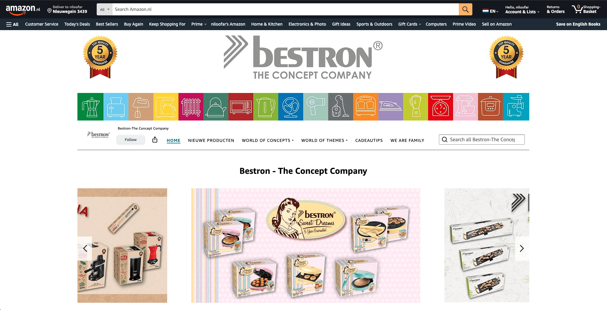
The old Bestron brand store feels lost in Amazon’s standard template, with its own branding buried under Amazon’s header and a cluttered hero area that never highlights best-sellers or new seasonal lines. Its overlapping “Concepts” and “Themes” menus lack clear definitions or in-page filters, so shoppers struggle to find what they’re looking for. Without context-rich imagery, seasonal badges, or strong calls-to-action, users get overwhelmed, drop off easily, and conversion rates suffer.

Key Problems
Key problems:
Brand dilution: Amazon’s header and layout dominate, obscuring Bestron’s own branding .
Weak hero section: No prominent banner or curated “featured” products to grab attention.
Confusing taxonomy: Overlapping “Concepts” vs. “Themes” menus without clear definitions or in-page filtering .
Lack of context: Images aren’t accompanied by text or tooltips explaining each concept’s story or benefits.
No seasonal highlights: New or limited-edition lines don’t stand out—users must hunt through undifferentiated thumbnails.
Poor UX on mobile: The nested menus and dense thumbnail grid aren’t optimized for smaller screens.
Missing calls to action: No “Shop now,” “Learn more,” or promotional incentives to drive clicks and reduce drop-off.
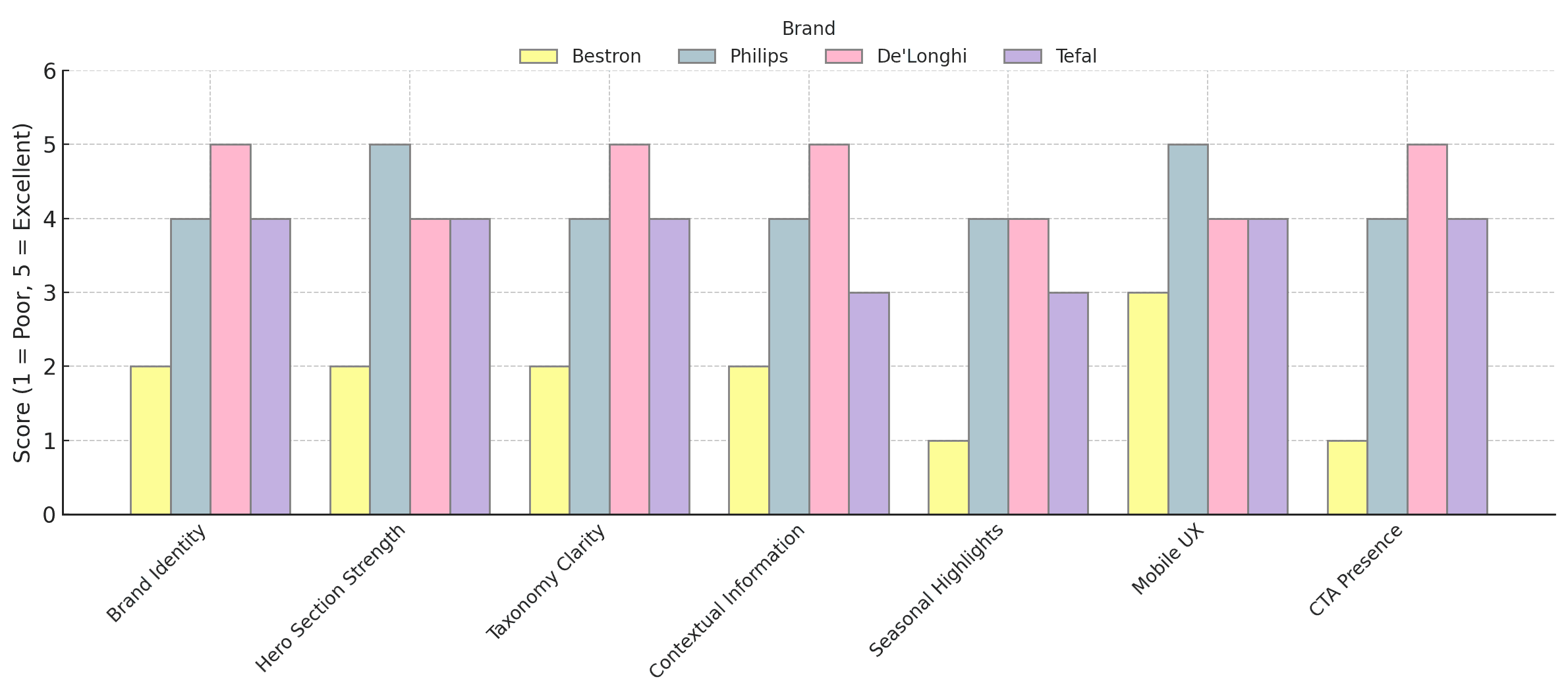
Competitor Analysis
We scoped out Philips, De’Longhi, and Tefal’s stores like curious shoppers, noticing what caught our eye and what made us click “buy.” Seeing how they spotlight seasonal drops, explain their concepts, and gently nudge us to the next step showed us exactly where Bestron’s store was fizzling out. This wasn’t just window shopping it gave us a clear map of where to crank up the brand’s personality, streamline the menus, and add those must-click moments so Bestron feels as irresistible as the rest.
The old Bestron brand store feels lost in Amazon’s standard template, with its own branding buried under Amazon’s header and a cluttered hero area that never highlights best-sellers or new seasonal lines. Its overlapping “Concepts” and “Themes” menus lack clear definitions or in-page filters, so shoppers struggle to find what they’re looking for. Without context-rich imagery, seasonal badges, or strong calls-to-action, users get overwhelmed, drop off easily, and conversion rates suffer.
Key problems:
Brand dilution: Amazon’s header and layout dominate, obscuring Bestron’s own branding .
Weak hero section: No prominent banner or curated “featured” products to grab attention.
Confusing taxonomy: Overlapping “Concepts” vs. “Themes” menus without clear definitions or in-page filtering .
Lack of context: Images aren’t accompanied by text or tooltips explaining each concept’s story or benefits.
No seasonal highlights: New or limited-edition lines don’t stand out—users must hunt through undifferentiated thumbnails.
Poor UX on mobile: The nested menus and dense thumbnail grid aren’t optimized for smaller screens.
Missing calls to action: No “Shop now,” “Learn more,” or promotional incentives to drive clicks and reduce drop-off.
We scoped out Philips, De’Longhi, and Tefal’s stores like curious shoppers, noticing what caught our eye and what made us click “buy.” Seeing how they spotlight seasonal drops, explain their concepts, and gently nudge us to the next step showed us exactly where Bestron’s store was fizzling out. This wasn’t just window shopping—it gave us a clear map of where to crank up the brand’s personality, streamline the menus, and add those must-click moments so Bestron feels as irresistible as the rest.
Customer Journey
Customer Journey
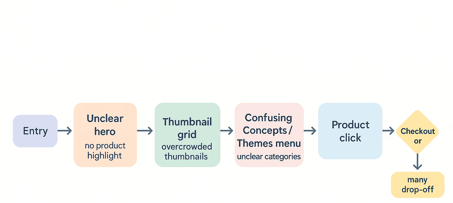
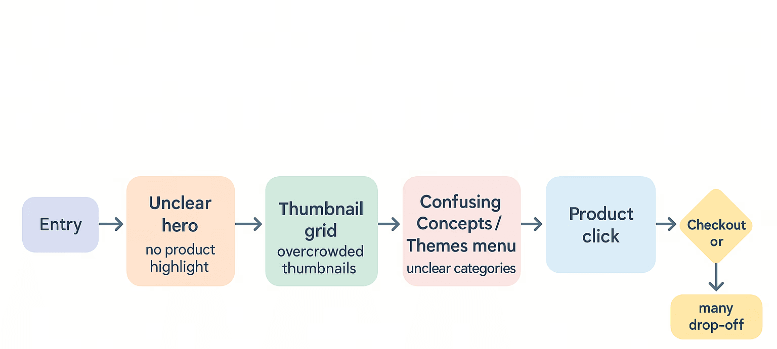
Upon analyzing the current customer journey on Bestron’s Amazon store, we uncovered several critical friction points: customers are immediately pulled away by Amazon’s global header, the hero section fails to spotlight any key products, and a dense grid of unlabeled thumbnails leaves them guessing where to click next. The overlapping “Concepts” and “Themes” menus only add to the confusion, forcing shoppers to hunt through poorly defined categories before they even see a product detail page. These obstacles break the browsing flow, leading to frequent drop-offs long before checkout.
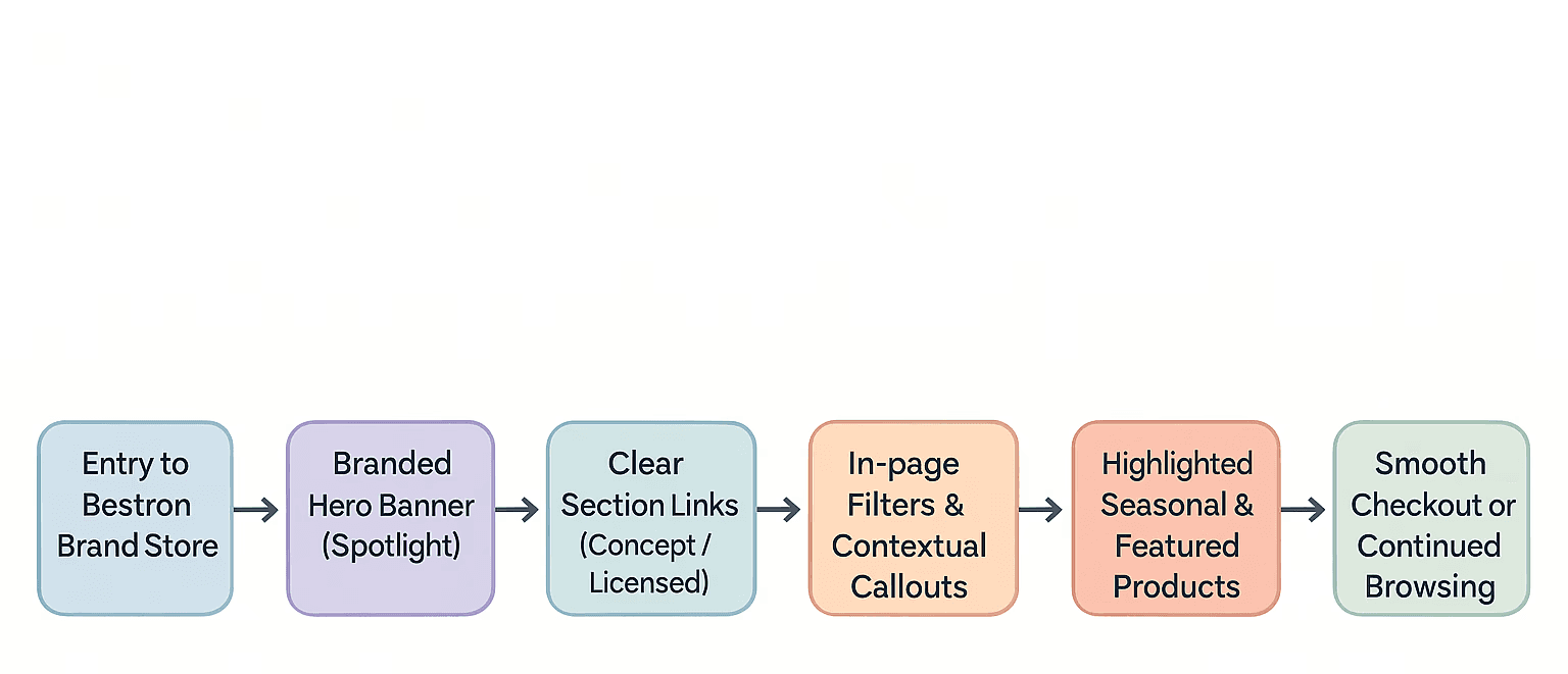
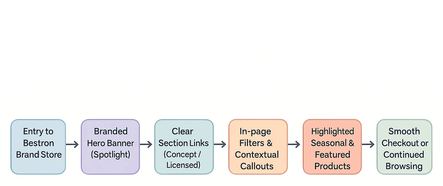
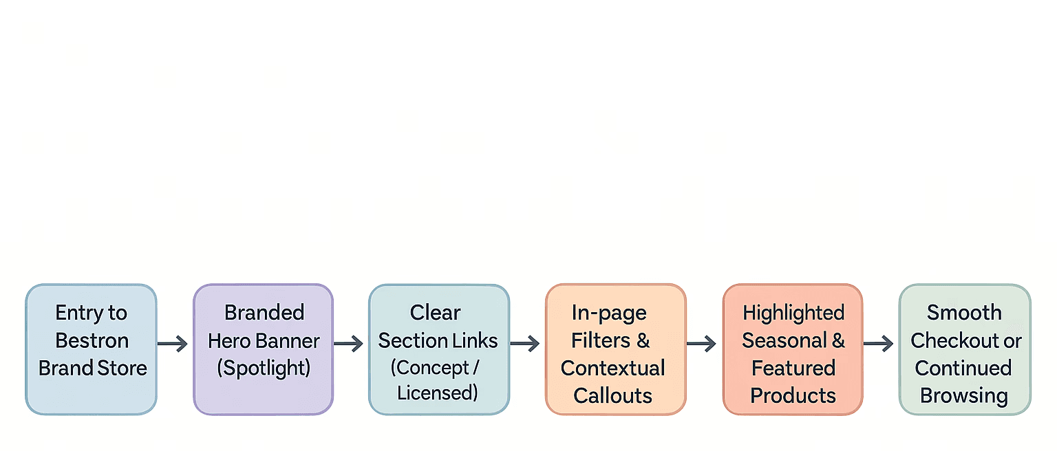
In the optimized journey, visitors land on a clean, fully branded store page that immediately highlights Bestron’s top collection in a striking hero banner. From there, clear section links guide them to concept lines, seasonal drops, or licensed products, while in-page filters and contextual callouts help narrow choices without overwhelming. Highlighted seasonal and featured products then catch the eye, and prominent “Buy Now” buttons and streamlined checkout prompts make it effortless to convert—or seamlessly continue browsing for more inspiration.
Current Journey
Optimized Journey
Optimized Journey
Optimized Journey
Structural Flow
Structural Flow
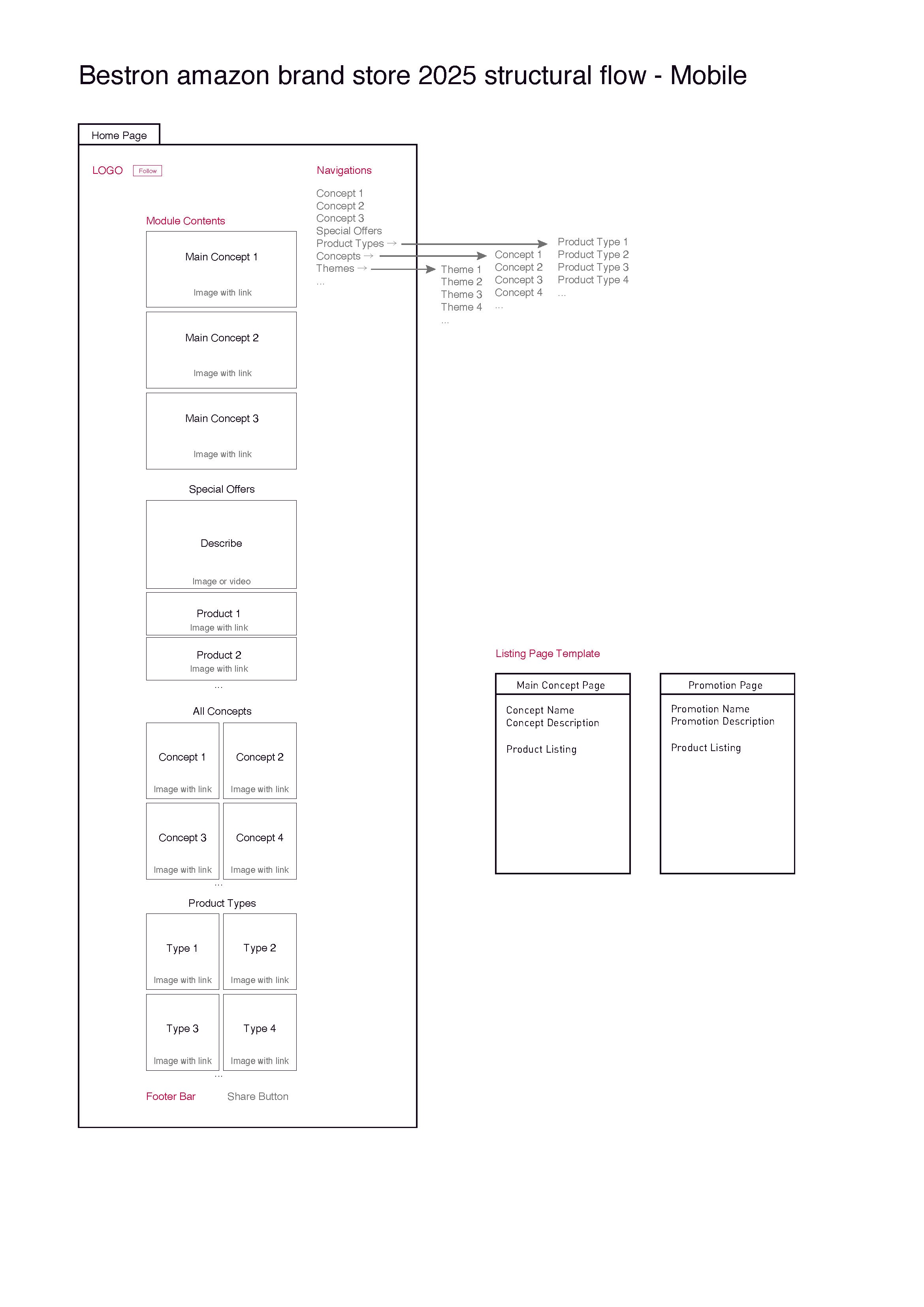
We structured the store with a clear top menu—Home, Concept Lines, Seasonal, and More—so shoppers always know where they are. The main area uses simple tiles for product types, concepts, and themes, making it easy to dive straight into what interests you. On mobile, we kept a collapsible menu and fixed follow/share buttons so key options stay accessible. Seasonal drops and licensed products live in their own highlighted sections, and “Add to Cart” buttons sit right next to featured items. Every element is placed to minimize confusion, put the spotlight on our best lines, and get users from browsing to checkout as directly as possible.
We structured the store with a clear top menu—Home, Concept Lines, Seasonal, and More—so shoppers always know where they are. The main area uses simple tiles for product types, concepts, and themes, making it easy to dive straight into what interests you. On mobile, we kept a collapsible menu and fixed follow/share buttons so key options stay accessible. Seasonal drops and licensed products live in their own highlighted sections, and “Add to Cart” buttons sit right next to featured items. Every element is placed to minimize confusion, put the spotlight on our best lines, and get users from browsing to checkout as directly as possible.

Style Guide & Final Design
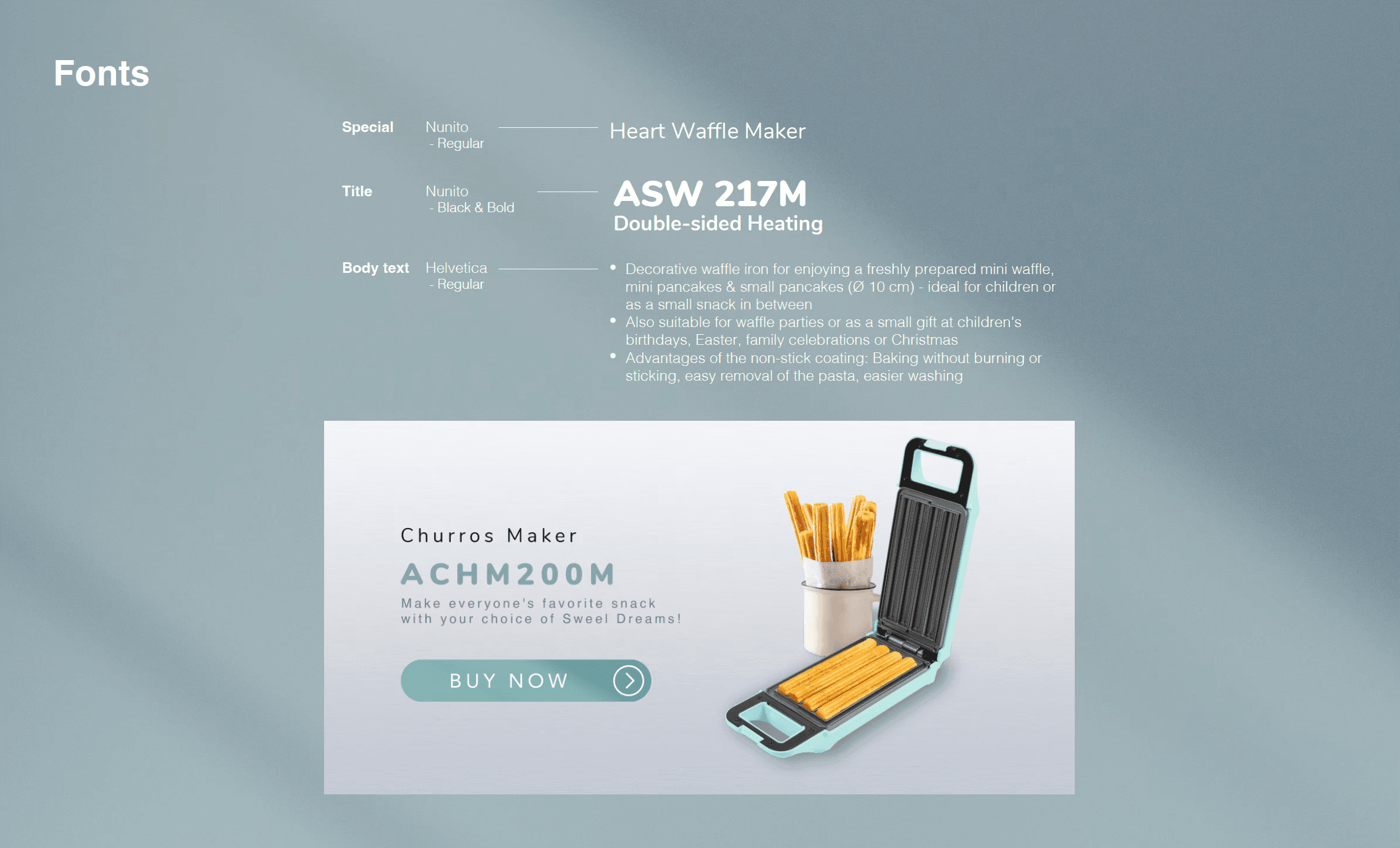
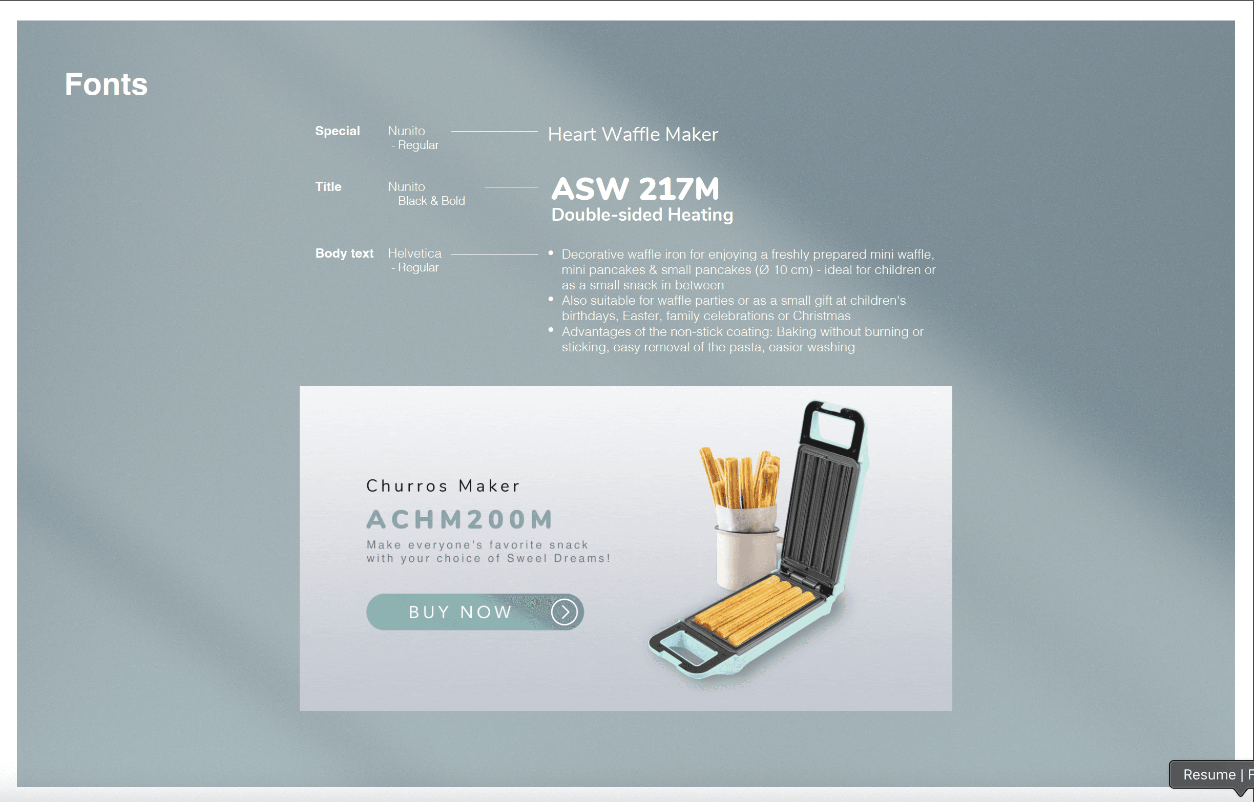
We started by nailing down Bestron’s core colors, typefaces, icon style, and spacing rules in a simple style guide. With our palette of soft yellows, grays, and teals and a clear hierarchy using Nunito and Helvetica, we defined how every element should look—buttons, headings, cards, even the amount of padding around images. Then, whether it was the navigation bar, a seasonal banner, or a product card, we applied those same rules across the entire store. The result is a unified, clean design where every page feels like it belongs to the same family and guides shoppers without distraction.
We started by nailing down Bestron’s core colors, typefaces, icon style, and spacing rules in a simple style guide. With our palette of soft yellows, grays, and teals and a clear hierarchy using Nunito and Helvetica, we defined how every element should look—buttons, headings, cards, even the amount of padding around images. Then, whether it was the navigation bar, a seasonal banner, or a product card, we applied those same rules across the entire store. The result is a unified, clean design where every page feels like it belongs to the same family and guides shoppers without distraction.
Style Guide & Final Design

Get in touch
niloofar.gofstudio@gmail.com
Get in touch !
niloofar.gofstudio@gmail.com
The project is about redesigning Bestron’s brand store to offer a seamless, engaging experience—spotlighting their top concept lines, fresh seasonal collections, and licensed products—while guiding customers effortlessly through each section to keep them engaged, cut down on drop-offs, and drive up conversions.
The old Bestron brand store feels lost in Amazon’s standard template, with its own branding buried under Amazon’s header and a cluttered hero area that never highlights best-sellers or new seasonal lines. Its overlapping “Concepts” and “Themes” menus lack clear definitions or in-page filters, so shoppers struggle to find what they’re looking for. Without context-rich imagery, seasonal badges, or strong calls-to-action, users get overwhelmed, drop off easily, and conversion rates suffer.
Project Overview
We scoped out Philips, De’Longhi, and Tefal’s stores like curious shoppers, noticing what caught our eye and what made us click “buy.” Seeing how they spotlight seasonal drops, explain their concepts, and gently nudge us to the next step showed us exactly where Bestron’s store was fizzling out. This wasn’t just window shopping—it gave us a clear map of where to crank up the brand’s personality, streamline the menus, and add those must-click moments so Bestron feels as irresistible as the rest.
Get in touch !
niloofar.gofstudio@gmail.com
The project is about redesigning Bestron’s brand store to offer a seamless, engaging experience—spotlighting their top concept lines, fresh seasonal collections, and licensed products—while guiding customers effortlessly through each section to keep them engaged, cut down on drop-offs, and drive up conversions.
Problem Definition
Key problems:
Brand dilution: Amazon’s header and layout dominate, obscuring Bestron’s own branding .
Weak hero section: No prominent banner or curated “featured” products to grab attention.
Confusing taxonomy: Overlapping “Concepts” vs. “Themes” menus without clear definitions or in-page filtering .
Lack of context: Images aren’t accompanied by text or tooltips explaining each concept’s story or benefits.
No seasonal highlights: New or limited-edition lines don’t stand out—users must hunt through undifferentiated thumbnails.
Poor UX on mobile: The nested menus and dense thumbnail grid aren’t optimized for smaller screens.
Missing calls to action: No “Shop now,” “Learn more,” or promotional incentives to drive clicks and reduce drop-off.
Problem Definition
The old Bestron brand store feels lost in Amazon’s standard template, with its own branding buried under Amazon’s header and a cluttered hero area that never highlights best-sellers or new seasonal lines. Its overlapping “Concepts” and “Themes” menus lack clear definitions or in-page filters, so shoppers struggle to find what they’re looking for. Without context-rich imagery, seasonal badges, or strong calls-to-action, users get overwhelmed, drop off easily, and conversion rates suffer.
Project Overview
The project is about redesigning Client’s brand store to offer a seamless, engaging experience—spotlighting their top concept lines, fresh seasonal collections, and licensed products—while guiding customers effortlessly through each section to keep them engaged, cut down on drop-offs, and drive up conversions.
Current Journey
Current Journey
Customer Journey
In the optimized journey, visitors land on a clean, fully branded store page that immediately highlights Bestron’s top collection in a striking hero banner. From there, clear section links guide them to concept lines, seasonal drops, or licensed products, while in-page filters and contextual callouts help narrow choices without overwhelming. Highlighted seasonal and featured products then catch the eye, and prominent “Buy Now” buttons and streamlined checkout prompts make it effortless to convert—or seamlessly continue browsing for more inspiration.
Upon analyzing the current customer journey on Bestron’s Amazon store, we uncovered several critical friction points: customers are immediately pulled away by Amazon’s global header, the hero section fails to spotlight any key products, and a dense grid of unlabeled thumbnails leaves them guessing where to click next. The overlapping “Concepts” and “Themes” menus only add to the confusion, forcing shoppers to hunt through poorly defined categories before they even see a product detail page. These obstacles break the browsing flow, leading to frequent drop-offs long before checkout.
In the optimized journey, visitors land on a clean, fully branded store page that immediately highlights Bestron’s top collection in a striking hero banner. From there, clear section links guide them to concept lines, seasonal drops, or licensed products, while in-page filters and contextual callouts help narrow choices without overwhelming. Highlighted seasonal and featured products then catch the eye, and prominent “Buy Now” buttons and streamlined checkout prompts make it effortless to convert—or seamlessly continue browsing for more inspiration.
Current Journey
Current Journey
Optimized Journey
Optimized Journey
Structural Flow
Style Guide & Final Design
We started by nailing down Bestron’s core colors, typefaces, icon style, and spacing rules in a simple style guide. With our palette of soft yellows, grays, and teals and a clear hierarchy using Nunito and Helvetica, we defined how every element should look—buttons, headings, cards, even the amount of padding around images. Then, whether it was the navigation bar, a seasonal banner, or a product card, we applied those same rules across the entire store. The result is a unified, clean design where every page feels like it belongs to the same family and guides shoppers without distraction.
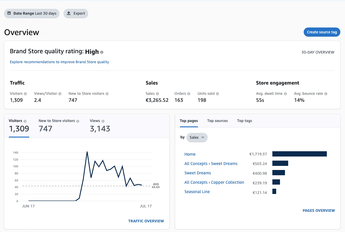
Project Impact
First 2 Weeks Post-Launch
Traffic Surge:
The brand store attracted 1,309 visitors, with 747 being new visitors, indicating strong outreach and visibility right after launch.Engaging User Experience:
With an average of 2.4 views per visitor and a low bounce rate of 14%, users explored multiple sections of the store, reflecting effective UX design and content layout.Strong Sales Performance:
In just two weeks, the store generated €3,265.52 in sales, resulting from 163 orders and 198 units sold, proving the store’s commercial viability and conversion strength.Effective Page Hierarchy:
The Home page alone contributed over €1,700 in sales, showing the landing page design and promotional strategy were successful in driving transactions.Top Performing Sections:
Concept pages like "Sweet Dreams" and "Copper Collection" showed strong performance, generating over €1,100 combined, validating the thematic and visual storytelling approach.High Store Quality Rating:
Amazon ranked the store’s quality as "High", reinforcing the professional execution and user-centered strategy.Average Engagement Time:
Users spent 55 seconds on average on the store, suggesting that product detail pages and visuals held their attention effectively.